|
Price Range Projection: Weekly High: ~ $86.580 Weekly Low: ~ $82.818 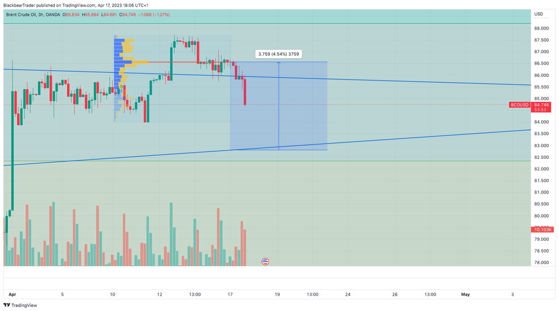 In the chart above, you can see the price on the 3-hour timescale, along with a fixed range volume profile. Weekly High Projection The fixed range volume profile (the horizontal histogram) is an indicator that can be used to show resistance and support levels. The red horizontal line in the close-up chart above indicates the point of control, which is the price level that had the most volume. As you can see, the price stalled around this point. This is where I see the weekly high. Weekly Low Projection I have placed the weekly low at a previous support level, which was formed from a chart pattern that had a breakout more than a month ago. You can see this in the chart below. 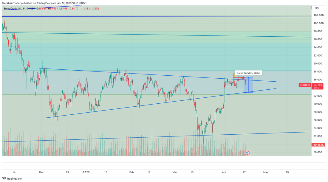
0 Comments
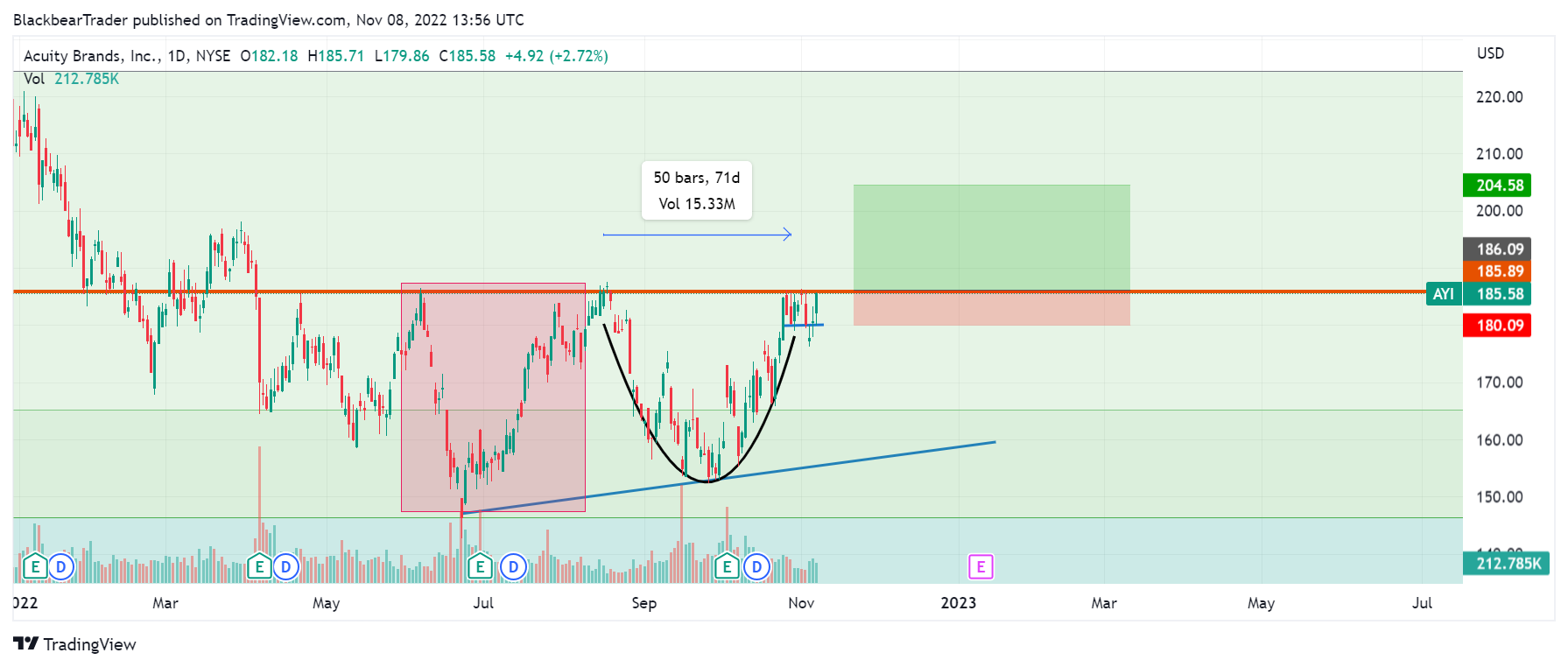 Acuity Brands, Inc (AYI) is an industrial technology company. They provide lighting and building management solutions in North America and internationally. The company was incorporated in 2001 and is headquartered in Altana, Georgia. AYI is a component of the S&P 400 Mid Cap Index Market Cap: 5.968B Beta (5Y Monthly): 1.54 PE Ration (TTM) 16.75 Average Volume: 277,357 (1) Cup and Handle (Bull Market Stats): Overall performance rank (1 is best): 3 out of 39 Breakeven failure rate: 5% Average rise: 54% Throwback rate: 62% Percentage meeting price target: The above numbers are based on 913 perfect trades. (2) AYI Daily Volatility (Standard deviation YTD): 2.20% Annualized Volatility (Standard Deviation YYD): 34.24% S&P 400 Mid Cap Index Daily Volatility (Standard deviation YTD): 1.59% Annualized Volatility (Standard Deviation YYD): 24.76% (The above were calculated using historical data) The data above shows the daily and annualized volatility for AYI and the index it is a component of. As you can see AYI has a higher daily and annualized volatility. This can be good or bad. Depending on the way the stock goes and your position. For this pattern, I would say this is a good thing as the pattern requires volatility to breakout and reach the price target. AYI has formed a cup and handle chart pattern. This pattern, as the name suggests, looks like the top ridge of a cup and the handle. The pattern forms as follows: price rise - left peak forms - price goes down at an angle and forms a trough - price rises again at an angle to form a peak. Sometimes, as in this case, the right peak may form a flag/consolidation pattern as well. The blue line on the chart above represents a line of support for the stock. The red box represents what could possibly be a previous cup and handle position. However, in this pattern and the one on the right, I'm not that convinced of their authenticity. The price rise before the pattern formations is not that convincing. I would ideally like to see an upwards trend for at least 3 months. As you can see in the chart below. 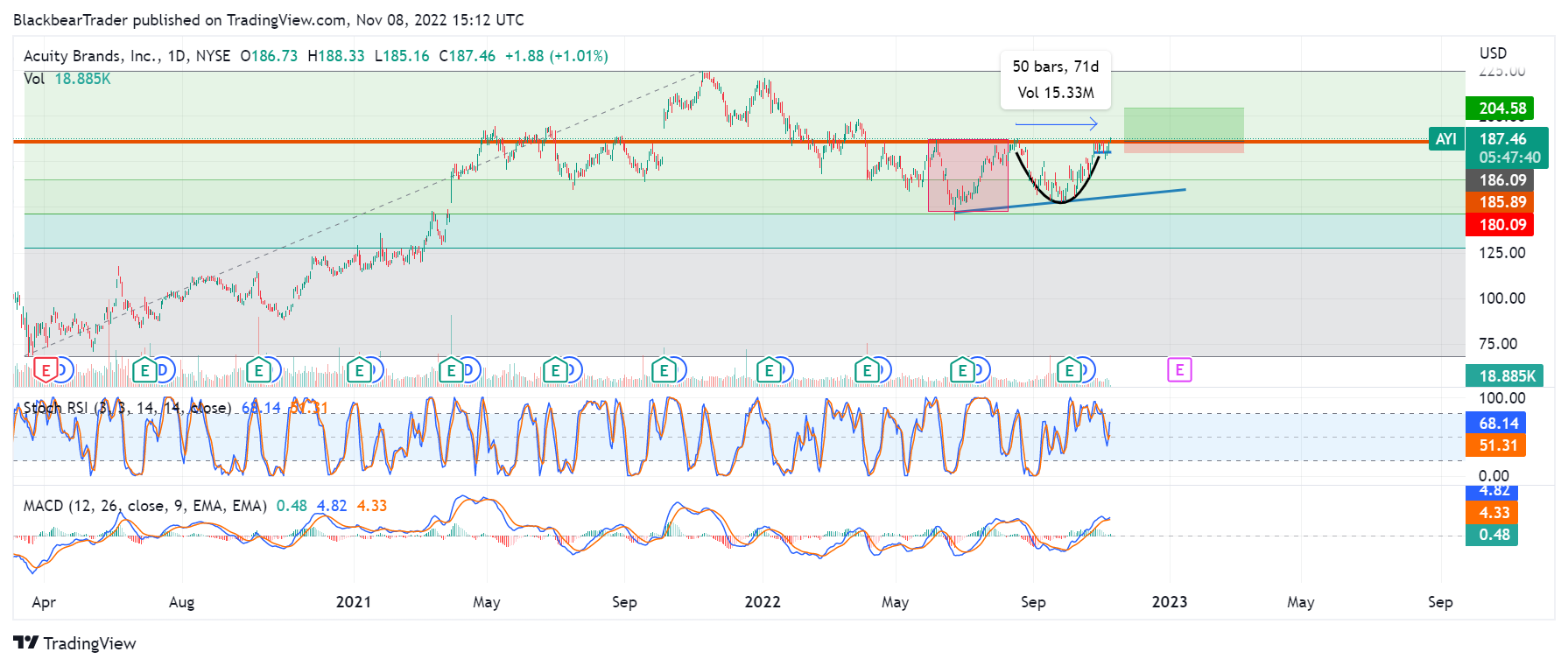 Cup and handle patterns are ranked 3/34 patterns - meaning when done right, the pattern can bring good performance. The Breakeven failure rate is 5% which is low and hence a good signal. The Throwback rate is 62% which may be a concern. Especially if the pattern is not that strong - as in this case. Totaling this all together, I would give this pattern a rating is 3/5. The ROI may not seem sufficient to justify a long position. Henceforth this is a riskier position. The main issues are:
The pattern duration is around 10 weeks. This is within the range of ideal 7 - 65 weeks, albeit at the lower end of the spectrum. The price target is the difference between the right peak and trough * the percentage meeting price above: $204.54 From the current price that represents a 9.13% ROI. Macroeconomic considerations: Interest rates are rising and so will inflation. We are most likely in a recession. I would not be concerned about this for this trading idea. This will most likely be a short-term trade for a couple of weeks once the stock breaks out with a close above the trendline. Fundamental analysis: Since this will be a short-term trade I did not find the need to include any further analysis - the next earnings is not until January so no concerns. References: 1 finance.yahoo.com/quote/AYI 2 thepatternsite.com/cup.html 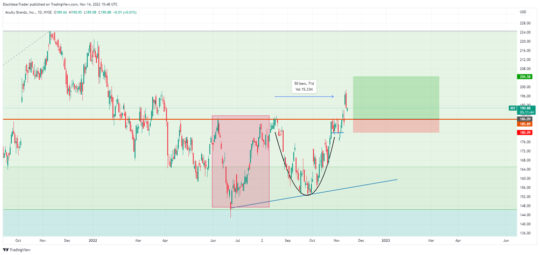 Just sending an update:
As you can see from the chart above the stock has broken out of the cup and handle pattern. This signals a buy. The stock at the peak of the breakout was already 50% of the way to the take-profit. However, caution must be taken, as the peak of the breakout has reached a previous resistance level. As you can see from the previous peak before the cup and handle position formed. If a buy is taken, one may want to watch out for the resistance level as it can limit upside. A good place to put a stop limit to reduce loses would be at the bottom of the handle - around the $180 mark.  Brent Crude Oil has fallen quite far from its yearly high of $135. That was almost two months ago. Ever since the price crashed down to $100 in less than two weeks from the high, the price has been swinging very nicely between Fibonacci levels. I had done some analysis of that in a previous post. However, today I will be analysing two chart patterns that have formed. The first that has already broken out is a flag. This is a specific chart pattern that forms after there has been a quick steep price rise (pole) and then a consolidation period (flag). The second is a descending broadening wedge.
Ideally from my learning, you want the flag patterns and any chart patterns to be on the daily timeframe. That is how I learnt it, I have had some success trading chart patterns on a short timeframe and I have largely seen other people do the same. However, I don’t know if this is just luck or actual trading. So, I will still use them just for educational purposes so that you may know what would be the case if it was on the daily or weekly frame. The flag pattern has already broken out so there’s no point in analysing it apart from getting a price target: Difference between bottom of pole ($99.938) to the top ($107.086) = $7.148 * 0.46 (percentage meeting price target) = $3.28 Add that to the bottom of the flag ($106.003) = $109.29. The Flag pattern has already broken out and reached its price target. So the main focus will be the Descending Broadening Wedge. Breakeven Failure Rate for upward breakouts: 18% Average Rise: 32% Throwback Rate: 62% The bottom of the pattern has found support at the 0.62 Fibonacci level. The price, ideally, should touch (not cut) the trendlines five or more times. A good split between the two trendiness. That isn’t really the case here. However, the volume has been trending upwards. This is of course ideal. The price target for this pattern is quite simple for upward breakouts, it's just the peak. So that would be $110.632. This trade may be a quick one, however. The pattern has formed between two Fibonacci levels so the price may rebound once it hits the upper level. Also, as you can see from the Stochastic RSI (upper Indicator on the bottom) a bullish cross over has emerged. Also, the MACD (lower indicator on the bottom) could possibly be closing in on a bullish cross over. Well, this is a bit embarrassing because by the time I finished my analysis the pattern broke out and reached its price target haha. Happy Trading! Last week I released two detailed technical analysis reports for two assets. Brent Crude Oil and AUD/USD. In this report, I will be analysing the trades, their success and what could have been improved. Brent Crude Oil 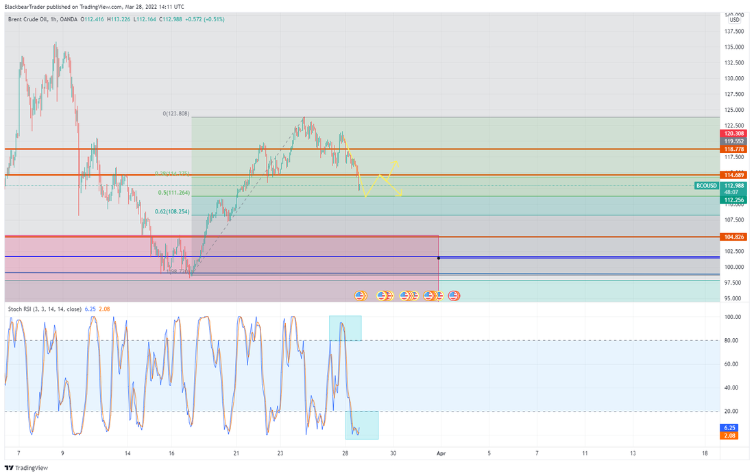 Brent Crude Oil was decreasing in price and using Fibonacci levels I gave an analysis of where the price could go. Looking at the chart below you can see that the price very broadly followed my prediction (yellow lines). It wasn't exact, but it was a good indicator of where the price could go if the Fibonacci levels were held true. As you can see they definitely were. Nearly every time the price touched or went near the Fibonacci levels/previous support/resistance the price went the opposite way to the next level. Therefore, we can conclude that last week would have been a very profitable time for a swing trader. Trading between these levels would have been great. I have to admit I did swing trade these levels myself. However, one important lesson I learnt was, when the price went near the Fibonacci/support/resistance levels the price didn't always fall or go up straight away. This led to me becoming trigger happy with the sell button. So, next time the price touches these levels I will not be trading very quickly instead I will be waiting for some form of confirmation. Possibly using the RSI or MACD indicator. This would mean I can buy/sell at the right time and not get caught in a sideways price moment that occurred a few times when the price was near the Fibonacci/support/resistance levels. Furthermore, I also realised that that price may form new resistance/support levels, this seems obvious, but when you are trading using old support/resistance levels, there seems to be a conflict. Do you use the old levels or the new ones formed? So next time I will be vigilant of such a conflict and will be coupling the support/resistance levels with other indicators to gauge a better outlook on where the price may be heading.  AUD/USD 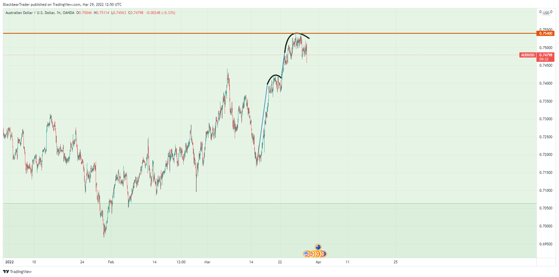 The currency pair AUD/USD had formed two inverted and ascending scallop patterns. I wasn’t very confident in these patterns. To be honest, I couldn’t pinpoint why. I think it's because it is a currency and there are too many things that could go wrong. Such as geopolitical or domestic political/economics issues. However, as you can see from the chart below, the patterns did work out very well. Even though I analysed both patterns, I stated that it would probably be better to just use the second scallop instead of the first. As the first scallop had already broken out and was very close to reaching its price target. Looking at the chart below you can see that the second scallop successfully broke out and is extremely close to it’s price target. The return on investment on this trade would have been around 1.35%. That isn’t very much compared to the Brent Crude Oil trade. However, it is still a profit nonetheless. The main lesson to learn here is, I should have done further analysis to reduce my doubts. Next time, if I feel like the trade may not be good I will do further analyse and see where my doubts lie to make a better judgement. 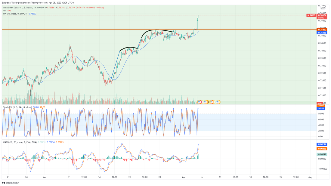 In the chart above AUD/USD has formed two Inverted and Ascending Scallops. These chart patterns look like the right side of an umbrella. The price quickly rises, before levelling off near the top in an inverted cup formation. The beauty of these patterns is they perform very well in both bull and bear markets.
Breakeven Failure rate: 9% Average Rise: 45% Throwback Rate: 66% Percentage Meeting Price: 64% 1 Usually, we would be looking for an upward trend leading to the pattern or at least a bullish turning point of a downward trend. In this case, the 8 days before the formation were downward. But since the end of February 2022, the price trend has been upward. So this may not be exactly ideal. The currency pair is AUD (Australian Dollar) / USD (US Dollar). This represents how many US Dollars one Australian Dollar will buy. So, for example, the GBP/USD is the British pound to the US Dollar. Currently, it's at 1.32. So if you got one British pound and converted it to US Dollars, you would get 1.32 in return. The main thing to understand here is, the currency pair will be affected by both Australian and US politics. So, even though this trade is on the one hour chart, you will have to watch out for any news coming out of the US and Australia. In my estimate, it may be at least one month before you see any good returns - that is if the pattern breaks out upwards. One month in the currency trading world is a long time. So if you are making this trade, watch out for any news and make sure you have a well-timed stop loss. Using the Measure rule 2 , we can form an estimate of where the price will go. In this estimate, I will separate both scallops and then combine them to get three estimates. Scallop One (The largest and first one on the chart): From the lowest Valley in the scallop to the highest peak in the pattern, the difference is 0.02404. The percentage meeting price (64%) X 0.02404 is 0.0153856. 0.0153856 + the price of the highest peak in the pattern is 0.7576156. This represents a 2.07% rise. Scallop Two: From the lowest Valley in the scallop to the highest peak in the pattern, the difference is 0.01589. The percentage meeting price (64%) X 0.01589 is 0.0101696. 0.0101696 + the price of the highest peak in the pattern is 0.7640196. This represents a 1.35% rise. Combining both Scallops: From the lowest Valley in the scallops to the highest peak in the patterns, the difference is 0.03574. The percentage meeting price (64%) X 0.03574 is 0.0228736. 0.0228736 + the price of the highest peak in the patterns is 0.7768036. This represents a 3.03% rise. To conclude, above are the three price targets you can use for an estimate. The breakout is when the price closes above the highest peak in the pattern. In this case, the first scallop has already broken out upwards successfully. So we will look at the second scallop for a breakout. Also, as the first scallop has broken out already, I would personally only use the second scallop estimate for a price target. Another thing to look out for is heavy breakout volume - as this suggests better performance. For the first scallop, there wasn't heavy breakout volume during the breakout. But, the pattern still performed well. So the heavy breakout volume isn't that important. In the chart above, Brent Crude Oil has just broken downwards from the 0.38 Fibonacci level. The second red line from the top is another level of prior support that oil has broken out from. Also, the Stochastic RSI diverged (Top Blue Rectangle). Since these events has occurred, the price of oil has been decreasing.
If oil carries ongoing downwards to the 0.5 Fibonacci level then we could see some good level of support, Stochastic RSI has also just diverged (Bottom Blue Rectangle). So, following this, the yellow line shows my price prediction. If oil carries on going down it could find some support at 0.5 and then rebound upwards. Then the price could find some resistance at the 0.38 level and if the buying power is strong enough the price could breakout upwards. If the buying power is not strong enough then oil could come back to the 0.5 level. Possibly even break through the 0.5 level, but that in opinion is not that likely. |
Here you will find my analysis of one asset a day. It will be mainly technical analysis but there will also be some fundamental analysis. I will try to blog at least one asset a day but if I do not believe there are any good opportunities or the analysis is not up to the minimum standard that day - I won't.
Archives
April 2023
Categories |
Search by typing & pressing enter
 RSS Feed
